
Stop Presenting Slides. Start Telling a Story.
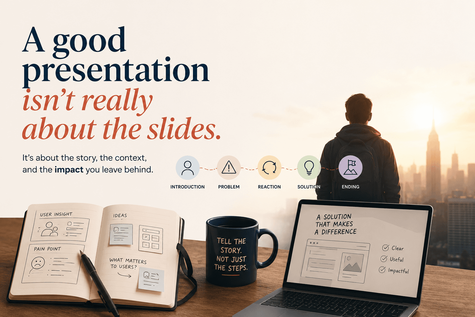
A good presentation isn't really about the slides.
As a UI/UX designer, I spend a lot of time making things look clear. And naturally, I used to bring the same mindset into presentations. Make the slides clean, fix the hierarchy, choose the right image, keep the typography consistent, make sure nothing is awkwardly misaligned. You know, designer things.
But after doing enough presentations, I realized that you could make a really beautiful deck and still give a presentation that nobody remembers.
Because presenting something clearly isn't only about what people see. It's also about what they hear, what they understand, and—maybe more importantly—what they feel as you take them through the story. That's something I explored in a sharing session I gave about presentation skills: how visual, auditory, and even the feeling of being involved in the presentation work together to create impact.
And somehow, I ended up explaining all of this using Spider-Man.
Yes. Spider-Man.
So, imagine your friend asks you about a movie.
You just watched Spider-Man and your friend asks, "Yo, udah nonton Spider-Man belum?"
You say yes, obviously, and they ask you what happened.
Now technically, you could start listing everything you remember. Peter gets bitten by a spider. He discovers his powers. This happens. Then that happens. Green Goblin appears. Uncle Ben—well, we know what happens to Uncle Ben. You could explain every scene accurately and still tells a terrible story.
Because when someone asks us about a movie, they don't really want a database of events. They want to experience enough of what we experienced to understand why the movie was interesting in the first place.
That's the question I used in the original sharing session: how do I tell this movie clearly and engagingly enough that the friend listening to me becomes interested in watching it too?
And when I thought about it that way, it started sounding suspiciously similar to what we do when presenting our work. We don't just want stakeholders to know what screens we designed. We want them to understand why we designed them. We don't just want them to see the research. We want them to understand why the findings matter.
And we definitely don't want to spend thirty minutes presenting only to end with someone asking: "Sorry, jadi sebenarnya yang berubah apa?"
Pain.
That's when storytelling becomes useful.
Most stories don't begin with the most exciting scene.
They give us enough context first. Peter Parker is just Peter Parker before he becomes Spider-Man. We understand his world, the people around him, and what his normal life looks like. Then something changes. He gets his powers, but the real tension comes from what happens afterward. There is a problem, an emotional shift, and eventually a question that needs to be answered.
The presentation framework I used describes this journey as Introduction, Problem, Reaction, Solution, and Ending. Not because every presentation needs to become a Hollywood movie, but because this structure gives information a reason to exist.
And this is where I think presentations—specially design presentations—sometimes go wrong. We often present things according to the order in which we worked on them. We did research, so here's the research. Then we benchmarked competitors, so here's the benchmark.
Then we made a user flow, so here's the user flow. Then we explored three designs, so here are Alternative A, Alternative B, and Alternative C.
Everything is correct. But being correct doesn't automatically make something interesting.
Your audience wasn't there when you spent three days looking at competitor products. They didn't watch your Figma file slowly grow from Frame 1 into Final_Final_Revision_ActuallyFinal_v4. They don't have the same context you do.
You have to build that context for them.
A presentation shouldn't feel like someone walking you through a file. It should feel like someone taking you somewhere.
That shift sounds small, but it changes the way I think about presenting design. Instead of asking myself, "What should the next slide contain?" I find it more useful to ask, "What does the audience need to understand next?"
Maybe they first need to understand that users are struggling. Then they need to understand why. Then they need to see what we discovered. Only after that does it make sense to show them the solution. Now the slides aren't just pages sitting next to each other. One creates a reason for the next one to exist.
Don't rush to the pretty screen.
This is probably the hardest part for designers because, obviously, we want to show the design. We explain the problem for approximately thirty-seven seconds and then immediately go:
"Okay, so here's our proposed solution." And suddenly there's a beautiful mockup on screen. Rounded corners. Nice typography. Perfect spacing. Everything looks expensive.
Great.
But why does it look like that?
Why did we choose this structure?
Why did something become more prominent?
Why did we remove something?
What did we learn between the problem and the solution?
That's the part of the story I called the reaction in the original session: what happens in response to the problem, how the journey gradually changes direction, and what process eventually leads us toward a solution.
You don't have to show every sticky note or every rejected wireframe to explain that journey. In fact, please don't. But show the decisions that mattered.
If user behavior changed your thinking, tell us.
If engineering constraints forced you to rethink something, that's part of the story.
If the first idea didn't work and taught you something that led to the final direction, that's interesting.
By the time you reveal the final design, people should already understand why it exists. Then your beautiful screen isn't just beautiful anymore. It becomes the answer to a question you've been building throughout the presentation. That's your payoff.
And then comes my favorite forgotten part: the ending.
Sometimes we spend weeks preparing a presentation, take everyone through the problem and the solution, show the prototype, explain the details...
and then the last slide says:
THANK YOU.
That's it. After all that emotional investment, apparently our grand finale is a stock photo and an email address. The ending should answer something bigger: what happens now?
If we implement this direction, what becomes better?
What does the experience look like for users?
What does this unlock for the business?
What decision are we asking people in the room to make?
In the sharing session, I described the ending as the part where we show what the future could look like and leave the audience with an outcome that can motivate or inspire them.
Spider-Man doesn't end the moment Peter figures out how to use his powers. It ends with us understanding who he's becoming. Your presentation deserves the same treatment. Maybe without swinging between buildings.
In the end, you're not presenting slides.
The more presentations I do, the less I think presentation skill is about being the loudest or most charismatic person in the room.
You don't need a TED Talk voice. You don't need fifty animated slides. You don't need to turn every quarterly report into Interstellar. You need to know what you're trying to say and help people follow you there.
Give them enough context to enter the story. Show them why there's a problem worth caring about. Let them understand how you responded to it. Make the solution feel like a natural answer instead of a surprise appearance from Figma. And when you reach the end, show them where that solution can take them.
That's basically the emotional journey I originally shared: Introduction → Problem → Reaction → Solution → Ending. Simple enough.
And yes, good slides still matter. I'm a designer; I'm not going to suddenly tell you to use Comic Sans and put seven paragraphs on one slide. But the slides are there to support the story. They aren't the story.
Because months after your presentation, people probably won't remember whether your title was 48px or 56px. But if the story was clear enough, they might still remember why your idea mattered.
And that's probably the presentation worth making.