
Good UI Is Not the Same as Good UX — And Your Users Can Tell
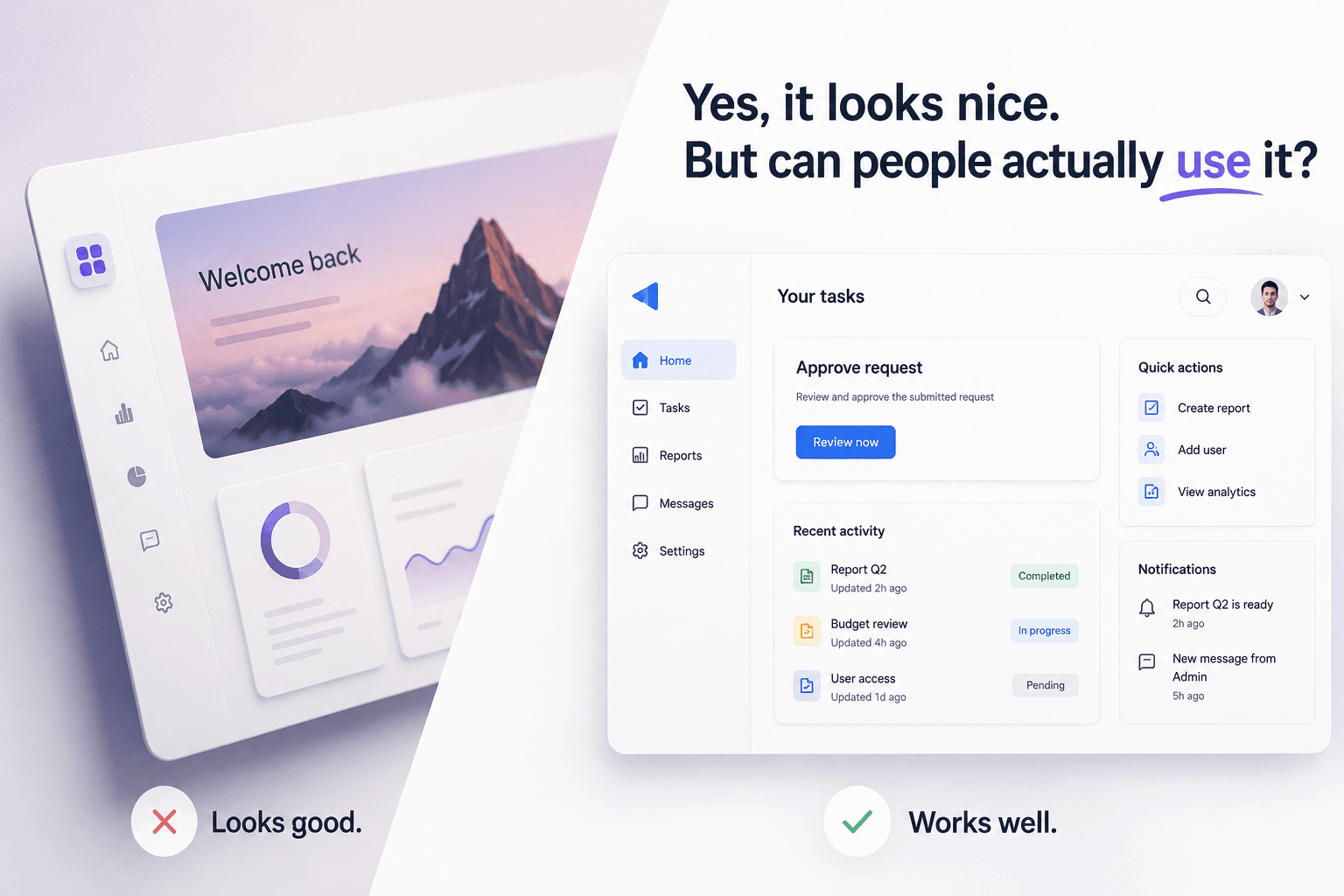
Yes, it looks nice. But can people actually use it?
We've all seen products that look beautiful in screenshots. Perfect spacing. Nice typography. Trendy colors. Smooth animations. Maybe even a gradient or two because, apparently, we're feeling adventurous. Then you actually try to use it. You can't find the button you need. You don't know what happens next. And somehow, completing a task that should take thirty seconds turns into a small personal journey.
That's the difference between an interface that looks good and an experience that works well. Good UI matters. But good UI alone doesn't automatically create good UX.
People don't use products to admire our screens.
As designers, it's easy to become attached to what we see. But users usually open a product because they need to do something. Book a flight. Approve a request. Check a report. Submit a form. Find information.
Their definition of a successful experience isn't:
"Wow, that's a beautifully designed card."
It's closer to:
"Oh, that was easy."
And interestingly, when UX works really well, users might not notice the design at all. That's usually a compliment.
The problem usually starts when visual decisions come before user decisions.
Imagine a dashboard with twelve beautifully designed cards. Everything is aligned. Everything follows the design system. Everything looks consistent. But the user only cares about three things. Now we've created a very polished interface that still makes people work harder than necessary.
This happens when we start asking:
"How should this screen look?"
before asking:
"What does the user need to accomplish here?"
UI should support that answer, not replace it.
So, does visual design not matter?
Of course it does. Visual hierarchy helps people understand where to look. Typography improves readability. Spacing reduces cognitive load. Color communicates status and priority. Consistency helps people learn how a product behaves. Good UI and good UX aren't competing disciplines. They strengthen each other. The problem is when visual polish becomes the finish line. Because a polished confusing experience is still a confusing experience. Just... prettier.
Before calling the design "done"
Ask a few simple questions:
Can users immediately understand what they can do here?
Is the most important information actually the easiest to find?
Can someone complete the main task without needing an explanation from the designer?
Are we solving a user problem, or mostly making the screen look impressive?
That last one can be uncomfortable.
It's also usually useful.
Design for the moment after the screenshot.
Screenshots matter. Presentations matter. Visual quality matters.
But eventually, someone has to actually use the thing.
They'll click the buttons.
They'll enter the wrong information.
They'll use it on a smaller screen than we expected.
They'll skip the instructions we carefully wrote.
They'll do things our perfect Figma prototype never anticipated.
That's where UX begins to matter more than the screenshot.
So yes, make it beautiful.
Just make sure it works, too.